
wired explainer
A short but informative explainer made with a sophisticated yet quirky style, talking about the dangers and uses of "Ultra Processed Foods"!
Time Complexity - 3 Weeks, Working in a group of two with Nick Bonilla
Category
Design, Animation
Role
Lead Designer, Animator, Sound Designer


the client
Wired, a Monthly American Magazine that now has an accompanying online website. They primarily focus on how emerging technologies affect culture, the economy, and politics, and commonly post videos on youtube as well to appeal to a young adult demographic.
the challenge
To better inform Wired's viewers by giving them video-based content to help explain today’s complex topics. Additionally, to create clear, engaging and visually stunning assets that support online articles.
research

Origins
Grunge, edgy and fun. The beginning of the Wired brand always aimed towards looking to the future. Focusing on the newest developments in technology, culture and science.
Their unique design style and particular marketing strategies made them stand out amongst the many magazines across the US.

Audience & Ideas
The target audience from the start has been people more in the younger side. Curious individuals with interests in modernity.

Branding & Visual Style
Choppy shapes, collaged elements, sleek graphics, bright, eye-catching colours. Characterized by a bold, yet modern aesthetic. Use of sans-serif fonts and a digital inspired colour palette fitting the tech & innovative content it pushes out.

“WIRED is where tomorrow is realized.
It is the essential source of information and ideas that make sense of a world in constant transformation.
The breakthroughs and innovations that we uncover lead to new ways of thinking, new connections, and new industries.”
initial pitch


From the proposed 3 designs, the client and creative director leaned heavily into the first style of a quirky and bright collage aesthetic, as it seemed to fit the branding and theme of the video the most.
visual development


design choices
It was at this stage, after deciding how we'd visualize the script, where multiple design choices had to be solidified to move further- and so my partner and I sat down to collect our thoughts to best for the client.
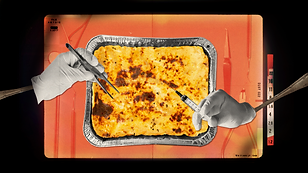
BRIGHT COLOURS, COLLAGE STYLE GRAPHICS & PIXEL/TECH THEMED MOTIFS
Chosen to capture the attention of someone browsing the internet or website, to encourage them to view the video. Also fits with WIRED's current branding, and adheres to the sophisticated yet fun feeling they have with their branding whilst also pushing further with more depth of field and overlaying elements to push the visuals more.
We also toyed around with choppy/irregular shape language and unnatural colours as a means to represent the "Ultra Processed Food", to more visually and intuitively convey our message that these Ultra Processed Foods may not be the best for you.
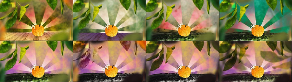
Different stages of developing a styleframe - seeing how colours work together, field blurs to add depth, comparing different hues, etc.


At this point, we're really starting to visualize this project and are testing out transitions, animations, etc. alongside finishing up all the styleframes.

final pass
Design & Animation by Hei Kuok & Nick Bonilla
Sound Design by Kelly Warner & Hei Kuok
Voice Over by Daniel Cantelm
Music from Universal Productions